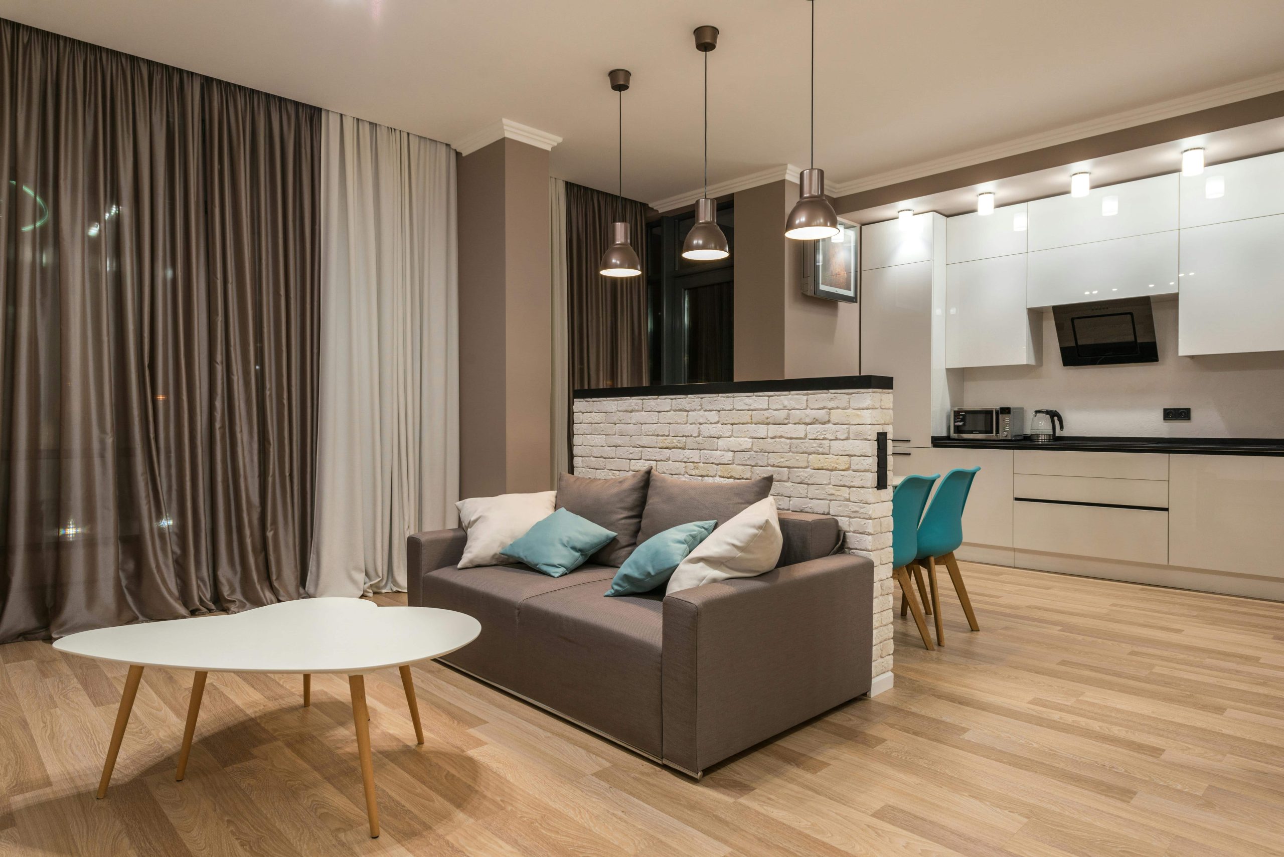
A room can have great furniture and still feel a little off, like every piece was chosen on a different day, in a different mood, with no one telling them they’d all have to live together.
Here’s the thing: the difference between “nice” and “expensive-looking” almost never comes down to more color. It comes down to less, repeated on purpose.
This is the no-stress way to land on a palette that feels pulled together instead of picked at random.
The mistake almost everyone makes
Choosing color as you go. A sofa you love, then a rug you love, then paint, then pillows, and suddenly you’re standing in the middle of it wondering why it feels chaotic even though every single piece is nice on its own.
The fix: choose your palette first, then only shop inside it. The room starts styling itself from there.
Step 1. Pick your base neutral
This is your main character: walls, big upholstery, major curtains, large rugs. Whatever shows up the most.
- Warm white or cream: soft, airy, classic
- Greige or mushroom: cozy, modern, forgiving
- Charcoal or soft black: dramatic, high contrast
- Warm wood tones count too, yes, really
If you’re stuck, go warm. Cool neutrals can tip into “cold office” fast.
Step 2. Choose a depth color
This is what gives a room weight: a painted wall, a darker sofa, a rug with deeper tones, drapery, a big piece of art.
Depth colors that tend to read expensive: deep olive, ink navy, espresso, charcoal, black. You don’t need much, just enough that the room stops looking flat.
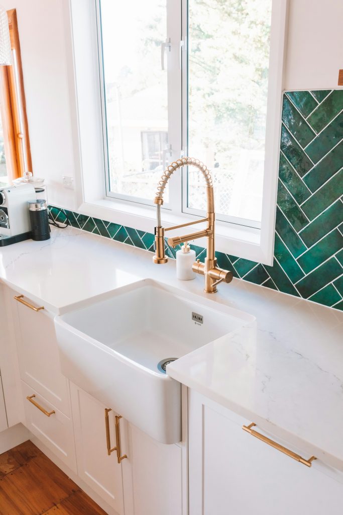
Step 3. Pick one metal finish, and only one
Mixing metals can look intentional. It can also look accidental. For now, keep it simple:
- Aged brass: warm, elevated
- Black: clean, modern
- Nickel or chrome: classic, crisp
Repeat it at least three times (hardware, a lamp, a frame, a mirror) so it reads as a choice, not a coincidence.
Step 4. Choose one accent color, and keep it controlled
This is where things usually go overboard. Your accent should feel like a signature, not a rainbow: olive green, muted clay, dusty blue, wine, soft black. Let it show up in small doses (a pillow, one chair, a vase, a throw).
Step 5. The 3-3-3 rule
For every key tone or material, repeat it at least three times: your depth color, your accent color, your metal finish. Brass on the cabinet pulls, the lamp base, and a frame reads as intentional. Brass in one spot just reads as leftover.
Step 6. Keep the contrast clean
Rooms that feel expensive usually have clear contrast: light against dark, smooth against textured, matte against a little shine. Too little contrast and the room washes out. Too much with no plan, and it gets loud. The sweet spot is controlled.
Step 7. Let texture do the heavy lifting
A simple palette needs texture to feel finished: linen, wool, velvet, boucle, wood grain, stone, matte ceramics. Simple palette plus layered texture is basically the whole trick.
A few palettes to steal, if you’re stuck:
- Warm white, charcoal, brass, olive
- Greige, espresso, black, ivory
- Cream, navy, nickel, warm wood
- Soft white, black, brass, clay
Commitment is half the magic here. Pick one and go.
The photo test
Take a quick picture of the room. If it looks messy even when it’s clean, your palette’s too scattered, or your accents are fighting each other, add repetition. If it looks flat, add one darker element, or layer in more texture.
Choosing a palette was never really about rules. It’s about deciding once, and letting everything else fall into line behind it. Keep it tight, repeat your tones, and don’t let one random “cute” find sneak in and throw the whole thing off. We’ve all been there.
Leave a Reply