You know when you walk into a space and it just feels… expensive? Not like “everything here cost a fortune,” but like everything makes sense. Nothing is fighting. Nothing feels random. It’s calm, cohesive, and somehow the room looks finished even if there isn’t a ton of stuff in it. That’s almost always a palette thing. Like yes, furniture matters, but color is what makes the room feel like it was chosen with intention instead of collected in a series of “wait this is cute” moments (been there).
The thing about expensive-looking palettes is they’re not loud. They’re not trying to prove anything. They’re usually built around a few tones that repeat in a way your brain reads as planned. It’s less “what’s my favorite color?” and more “what’s the mood I want this room to have?” Then you let that mood show up in the walls, the textiles, the finishes, the art—little echoes everywhere.
And the biggest secret? Expensive palettes aren’t necessarily complicated. They’re just consistent. Same undertone, same temperature, same vibe across the whole space. Warm stays warm. Cool stays cool. And then you add contrast in a controlled way so it doesn’t look flat.
Living Room
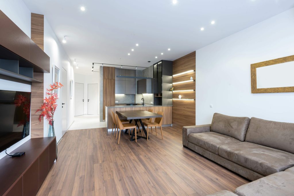
Living rooms look expensive when the palette feels grounded. Like there’s a base that holds everything together, and then a few deeper notes that make the space feel rich instead of “all beige, no personality.” Most high-end living rooms are basically a conversation between: soft neutrals + one darker anchor + a metal finish that repeats. Think warm white walls, a rug with some depth in it, and then black or brass showing up in small ways—frames, lamp bases, hardware, maybe a coffee table detail. It’s not about decorating every surface; it’s about making sure the pieces you do have belong to the same world.
Also: if your living room feels like it’s missing something, it might not need “more color,” it might need one deeper shade to stop it from floating. Like one charcoal element, one espresso wood, one olive chair, one darker art piece. Something that gives the room weight.
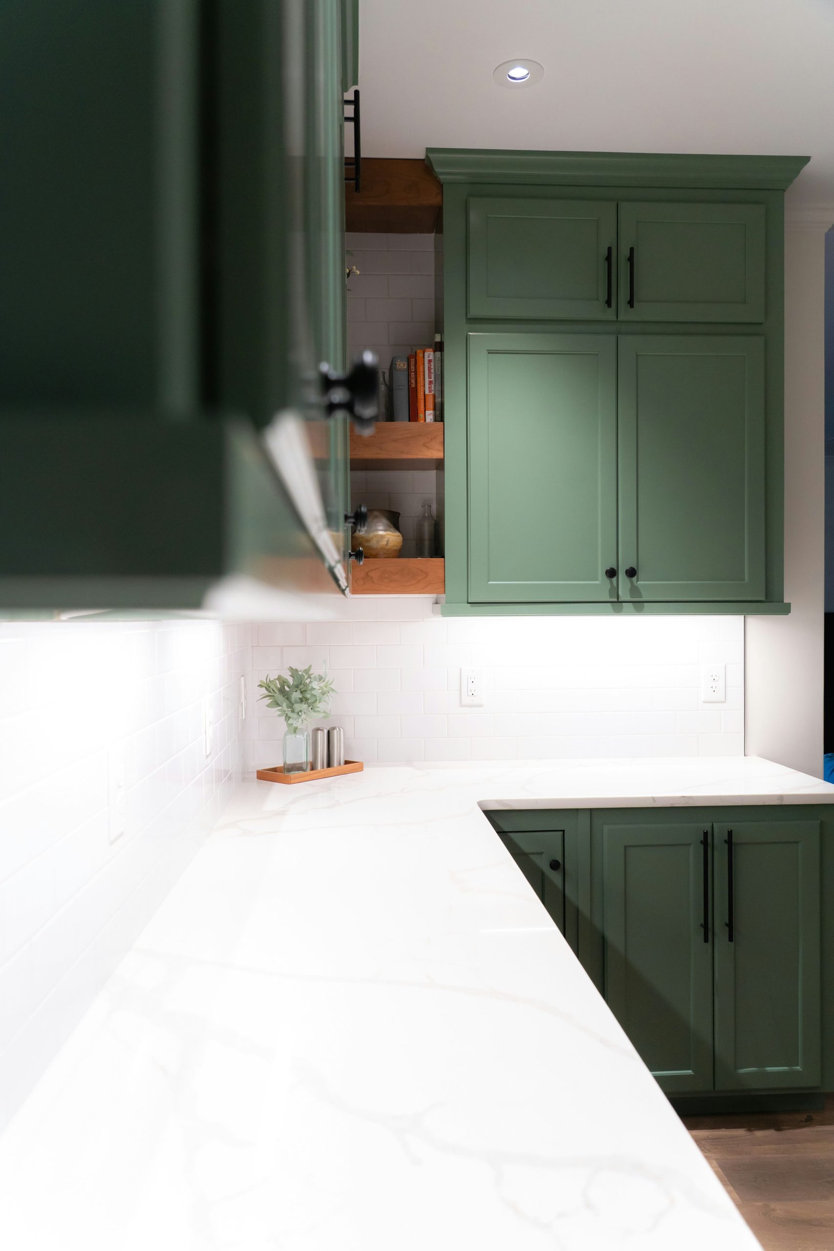
Kitchen
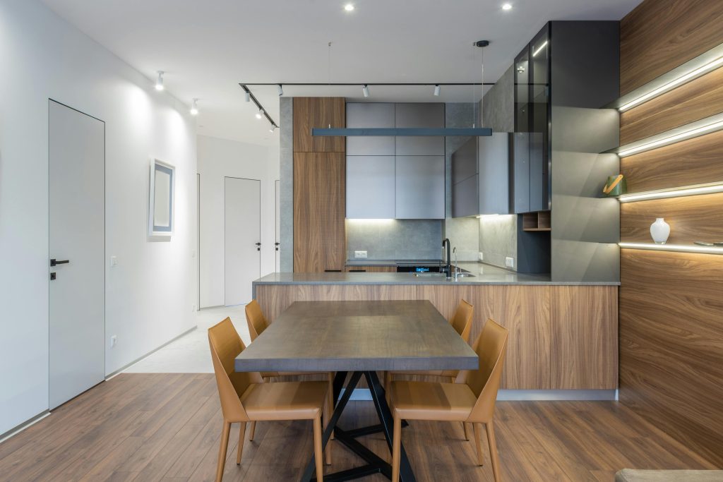
Kitchens are sneaky because they can look expensive with barely any “decor” at all, but only if the finishes are cohesive. You can have the prettiest cabinets in the world and still have it feel kind of… builder-basic if the tones don’t match. Expensive kitchens usually stick to a tight set: cabinet color, countertop tone, hardware finish, and then one accent that repeats (wood, black, brass, stone). The magic is when nothing looks accidental—like the hardware wasn’t chosen last minute, the faucet isn’t a totally different metal, and the lighting doesn’t feel like it came from a different house.
And if you’re adding color in a kitchen, it’s usually in a controlled way: maybe stools, a runner, a piece of art, or even just a bowl of fruit that looks intentional. The palette should feel like: clean base + one accent. Not “ten things competing on the counter.”
Dining Room
Dining rooms look expensive when they feel calm and a little dramatic, honestly. Even bright dining rooms have contrast—usually in the table, the chairs, or the lighting. If everything is the same tone, it can feel flat fast. The easiest way to elevate a dining palette is to treat the light fixture like jewelry. If the room is mostly neutral, a darker or more sculptural fixture adds that “oh this is a real room” feeling. And then your palette can stay simple: neutral walls + table tone + chair tone + one repeated metal.
Also, dining chairs are a huge palette opportunity. If the room is very airy, chairs in a deeper tone or textured fabric make it feel more expensive without making it busy. And if you’re using art, bigger is usually better. A single larger piece will read more elevated than a bunch of smaller random ones.
Bedroom
Bedrooms feel expensive when the palette is soft, layered, and not overly “theme-y.” Like you don’t want it to look like a catalog page for one specific trend—you want it to look like a hotel suite that still feels personal. The most expensive-looking bedrooms usually live in neutrals, then add depth through textiles: bedding, curtains, rug, and one darker touch (nightstands, headboard, art, or a bench). The palette shows up in layers, not in loud pops.
A trick that always works: repeat one tone across the bed and the rest of the room. If your bedding is creamy, echo that in curtains or a rug. If you add a darker pillow, echo that tone in the art frame or a lamp base. That repetition is what makes it feel intentional instead of “I added pillows because TikTok told me to.”
Bathroom
Bathrooms are where color palettes either look super expensive… or super chaotic, because there are so many product bottles trying to ruin your life. The most elevated bathrooms are basically: clean base + one finish + one soft accent. That’s it. White/stone walls, one metal finish (brass/black/nickel), and a small accent like wood, black, or a muted color in towels or art.
If you want your bathroom to look expensive, it’s less about “decorating” and more about editing. A pretty soap, one tray, one small arrangement, and everything else out of sight. A bathroom palette works best when the color story is quiet and the surfaces look calm.
Hallways + Entry
These are palette glue areas. People forget them, but they’re what makes the whole home feel cohesive. An entry looks expensive when it previews the palette of the rest of the house—like if your home leans warm neutral with black accents, the entry mirrors that. A hallway looks expensive when it doesn’t feel like a random blank corridor; a runner, a consistent frame color, a repeat of the home’s metal finish… suddenly it feels designed.
The “Expensive Palette” Look in One Sentence
An expensive palette is basically: a calm base, one deeper tone for weight, and a repeated finish—plus texture so it doesn’t feel flat. And the reason it works is because your eye isn’t bouncing around trying to figure out what the theme is. It just feels settled.
Honestly, once you start thinking of color like a story instead of a bunch of individual decisions, everything gets easier. Like you stop buying random “cute” things that don’t match anything, and you start choosing pieces that actually belong in your space. And then suddenly your room looks expensive—not because you spent more, but because it looks like you meant to do it.